Activity. Make a posting box
desired outcome
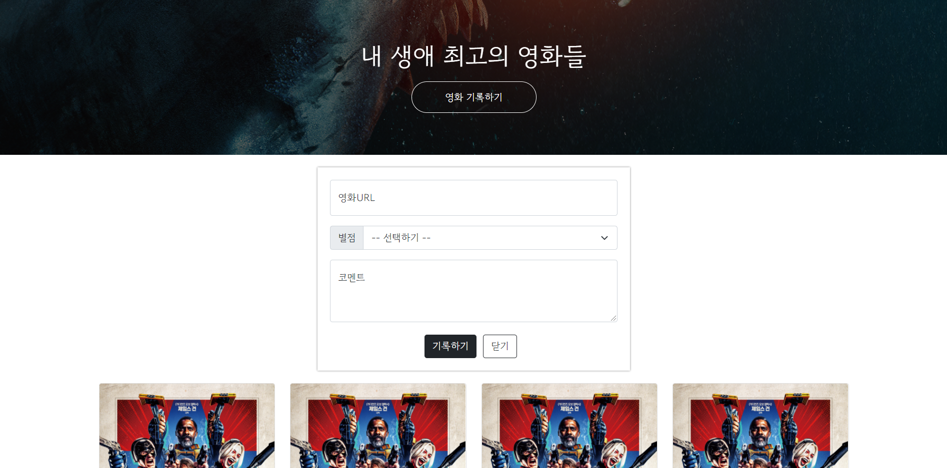
- Add a new
<div>betweenmytitleandwrap.
<div class="mypost">
- Change its width to 500px.
        .mypost {
            width: 500px;

            background-color: green;
        }
- Move mypost to the center.
        .mypost {
            width: 500px;

            background-color: green;

            margin: 20px auto 0px auto;
        }
- Add a shadow box by using,
box-shadow: 0px 0px 3px 0px gray;
       .mypost {
            width: 500px;

            background-color: green;

            margin: 20px auto 0px auto;

            box-shadow: 0px 0px 3px 0px gray;
        }

- Add padding for 20px and then remove the background color.
        .mypost {
            width: 500px;

            margin: 20px auto 0px auto;

            box-shadow: 0px 0px 3px 0px gray;

            padding: 20px;
        }

- Find and add 'Forms'-'Floating Label' in Bootstrap and 'Input group'-'Custom forms'
<!doctype html>
<html lang="en">

<head>
    <meta charset="utf-8">
    <meta name="viewport" content="width=device-width, initial-scale=1, shrink-to-fit=no">

    <link href="https://cdn.jsdelivr.net/npm/bootstrap@5.0.2/dist/css/bootstrap.min.css" rel="stylesheet"
          integrity="sha384-EVSTQN3/azprG1Anm3QDgpJLIm9Nao0Yz1ztcQTwFspd3yD65VohhpuuCOmLASjC" crossorigin="anonymous">
    <script src="https://ajax.googleapis.com/ajax/libs/jquery/3.5.1/jquery.min.js"></script>
    <script src="https://cdn.jsdelivr.net/npm/bootstrap@5.0.2/dist/js/bootstrap.bundle.min.js"
            integrity="sha384-MrcW6ZMFYlzcLA8Nl+NtUVF0sA7MsXsP1UyJoMp4YLEuNSfAP+JcXn/tWtIaxVXM"
            crossorigin="anonymous"></script>

    <title>스파르타코딩클럽 | 부트스트랩 연습하기</title>
    <link href="https://fonts.googleapis.com/css2?family=Gowun+Dodum&display=swap" rel="stylesheet">

    <style>
        * {
            font-family: 'Gowun Dodum', sans-serif;
        }

        .mytitle {
            background-color: green;

            width: 100%;
            height: 250px;

            background-image: linear-gradient(0deg, rgba(0, 0, 0, 0.5), rgba(0, 0, 0, 0.5)), url("https://movie-phinf.pstatic.net/20210715_95/1626338192428gTnJl_JPEG/movie_image.jpg");
            background-position: center;
            background-size: cover;

            color: white;

            display: flex;
            flex-direction: column;
            justify-content: center;
            align-items: center;
        }

        .mytitle > button {
            width: 200px;
            height: 50px;

            background-color: transparent;

            color: white;

            border-radius: 50px;

            border: 1px solid white;

            margin-top: 10px;
        }

        .mytitle > button:hover {
            border: 2px solid white;

        }

        .mycomment {
            color: gray;
        }

        .wrap {
            width: 1200px;
            margin: 20px auto 0px auto;
        }
        .mypost {
            width: 500px;
            margin: 20px auto 0px auto;
            box-shadow: 0px 0px 3px 0px gray;
            padding: 20px;
        }
        .mov_url {
            margin: 0px 0px 15px 0px;
        }
        .record > button {
            width: 100px;
            height: 30px;

            color: white;
            background-color: black;

            margin: 0px 10px 0px 0px;

            border-radius: 5px;
        }
        .record2 > button {
            width: 50px;
            height: 30px;

            color: gray;

            border-radius: 5px;
        }
        .mybtn {
            display: flex;
            flex-direction: row;
            justify-content: center;
            align-items: center;

            margin-top: 10px;
        }
        .mybtn > button {
            margin-right: 10px;
        }
    </style>
</head>

<body>
    <div class="mytitle">
        <h1>내 생애 최고의 영화들</h1>
        <button>영화 기록하기</button>
    </div>
    <div class="mypost">
            <div class="mov_url">
                <input type="영화URL" class="form-control" id="floatingInput" placeholder="영화URL">
            </div>
            <div class="input-group mb-3">
                <label class="input-group-text" for="inputGroupSelect01">별점</label>
                <select class="form-select" id="inputGroupSelect01">
                    <option selected>--선택하기--</option>
                    <option value="1">⭐️</option>
                    <option value="2">⭐⭐</option>
                    <option value="3">⭐⭐⭐</option>
                    <option value="4">⭐⭐⭐⭐</option>
                    <option value="5">⭐⭐⭐⭐⭐</option>
                </select>
            </div>
            <div class="form-floating">
                <textarea class="form-control" placeholder="Leave a comment here" id="floatingTextarea"></textarea>
                <label for="floatingTextarea">코멘트</label>
            </div>
            <div class="mybtn">
                <button type="button" class="btn btn-dark">기록하기</button>
                <button type="button" class="btn btn-light">닫기</button>
            </div>
    </div>
    <div class="wrap">
        <div class="row row-cols-1 row-cols-md-4 g-4">
            <div class="col">
                <div class="card h-100">
                    <img src="https://movie-phinf.pstatic.net/20210728_221/1627440327667GyoYj_JPEG/movie_image.jpg"
                         class="card-img-top" alt="...">
                    <div class="card-body">
                        <h5 class="card-title">여기에 제목이 들어갑니다. </h5>
                        <p class="card-text">여기에 내용이 들어가지요.</p>
                        <p>⭐⭐⭐</p>
                        <p class="mycomment">여기에 코멘트가 들어갑니다.</p>
                    </div>
                </div>
            </div>
            <div class="col">
                <div class="card h-100">
                    <img src="https://movie-phinf.pstatic.net/20210728_221/1627440327667GyoYj_JPEG/movie_image.jpg"
                         class="card-img-top" alt="...">
                    <div class="card-body">
                        <h5 class="card-title">여기에 제목이 들어갑니다. </h5>
                        <p class="card-text">여기에 내용이 들어가지요.</p>
                        <p>⭐⭐⭐</p>
                        <p class="mycomment">여기에 코멘트가 들어갑니다.</p>
                    </div>
                </div>
            </div>
            <div class="col">
                <div class="card h-100">
                    <img src="https://movie-phinf.pstatic.net/20210728_221/1627440327667GyoYj_JPEG/movie_image.jpg"
                         class="card-img-top" alt="...">
                    <div class="card-body">
                        <h5 class="card-title">여기에 제목이 들어갑니다. </h5>
                        <p class="card-text">여기에 내용이 들어가지요.</p>
                        <p>⭐⭐⭐</p>
                        <p class="mycomment">여기에 코멘트가 들어갑니다.</p>
                    </div>
                </div>
            </div>
            <div class="col">
                <div class="card h-100">
                    <img src="https://movie-phinf.pstatic.net/20210728_221/1627440327667GyoYj_JPEG/movie_image.jpg"
                         class="card-img-top" alt="...">
                    <div class="card-body">
                        <h5 class="card-title">여기에 제목이 들어갑니다. </h5>
                        <p class="card-text">여기에 내용이 들어가지요.</p>
                        <p>⭐⭐⭐</p>
                        <p class="mycomment">여기에 코멘트가 들어갑니다.</p>
                    </div>
                </div>
            </div>
        </div>
    </div>
</body>

</html>
How to adjust it for a mobile screen?
- We need to adjust
widthunder<.mypost>
        .mypost {
            width: 500px;
            margin: 20px auto 0px auto;
            box-shadow: 0px 0px 3px 0px gray;
            padding: 20px;
        }
        .mypost {
            max-width: 500px;
            width: 95%;

            margin: 20px auto 0px auto;
            box-shadow: 0px 0px 3px 0px gray;
            padding: 20px;
        }
- Do the same thing for
.wrap
        .wrap {
            max-width: 1200px;
            width: 95%;

            margin: 20px auto 0px auto;
        }